Background
We have spent a bit of time going over import, manupulation,
compensation, and transformation of flow cytometry data. Importantly, we
have used visualizations to highlight the importance of various steps.
Here, we dedicate some time to visualization of flow cytometry data
using ggcyto library from the cytoverse
For those who have experience working with ggplot, the
approach is going to be similar. As such, ggcyto provides a
easy to use yet powerful approach to visualize flow cytometry data.
It is also important to note that ggcyto works with each
of cytoframe, cytoset, GatingSet,
and GatingHierarchy and allows the user to utilize various
attributes of each of the object. For instance,
metadata within a cytoset and
GatingSet can be used to prepare insightful visualizations,
rapidly.
First, extract a cytoframe from the richly gated
GatingSet we worked in Gating cells in cytoverse. Shortly
we’ll also see how to work with the GatingSet itself.
library(CytoverseBioc2023)
cache_workshop_data()
gs <- make_transformed_gs(add_gates = TRUE)
cf <- gh_pop_get_data(gs[[1]],"root")
Hit the ground running using autoplot
The autoplot method is convenient for rapid generation
of plots with minimal effort.
- Bivariate plot
# cytoframe: bivariate plot
autoplot(cf,
         x = "CD4", # markername in human readable format
         y = "R730-A", # markername as colname of flowFrame
         bins = 256)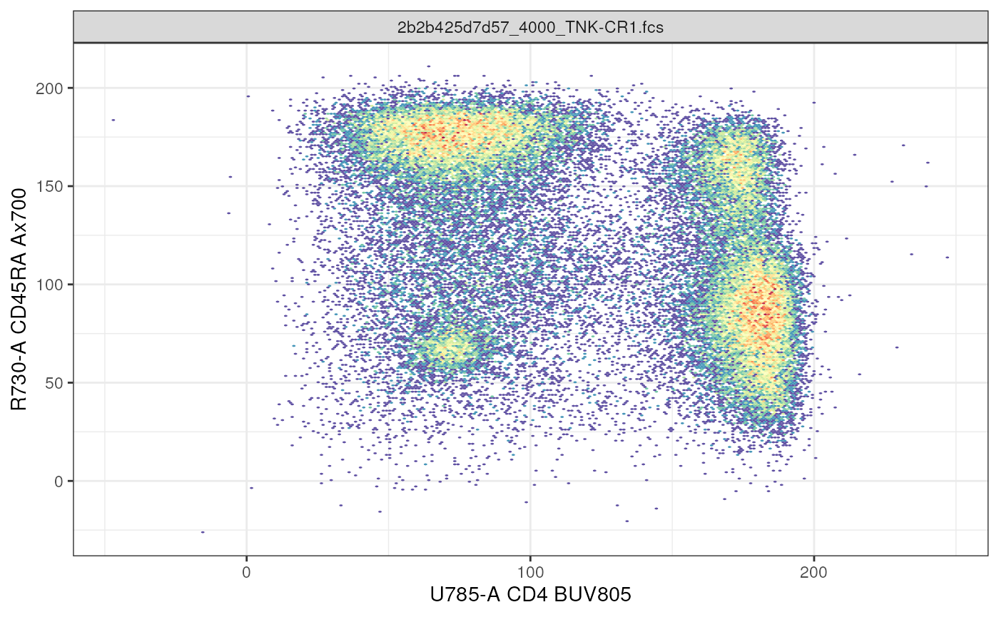
- Density plot
# cytoframe: density plot
autoplot(cf,
         x = "CD4")+ # y not results in a density plot
         geom_density() # utilize ggplot geom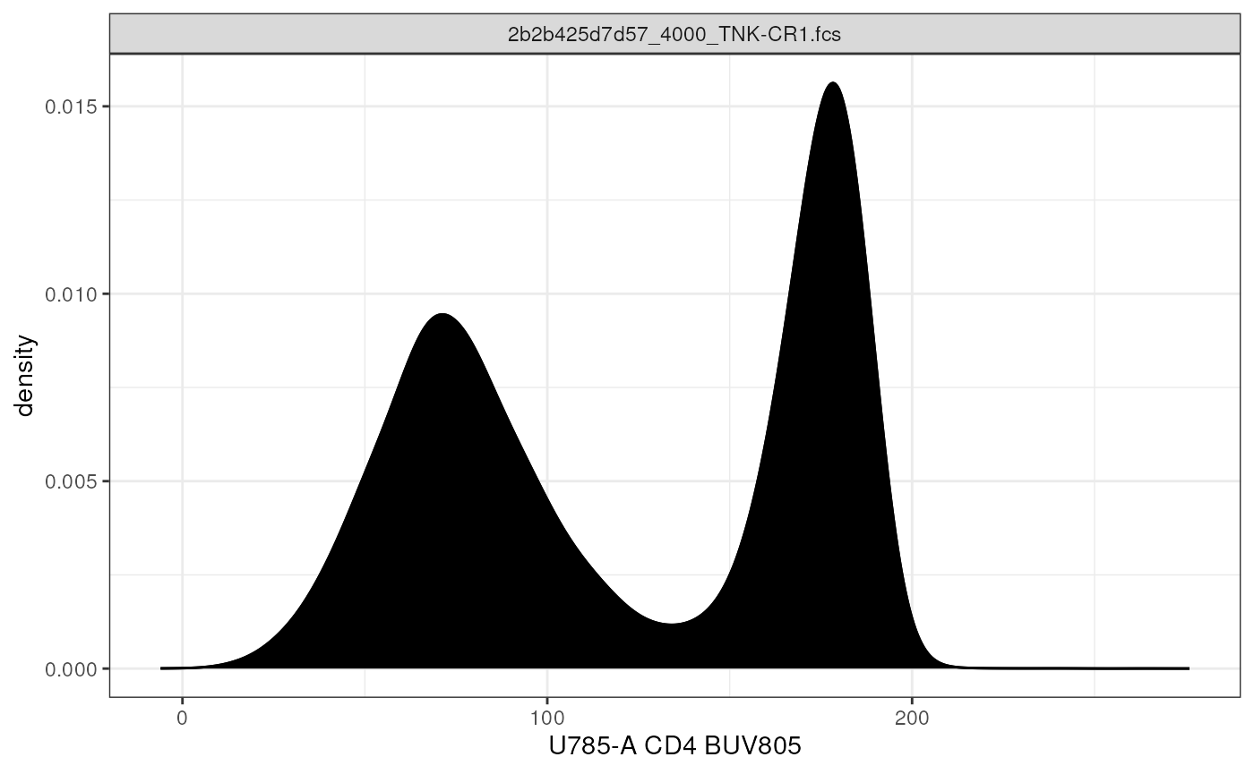
- Bivariate plot of the entire
GatingHeirarchy
# GatingSet: full GatingHierachy
autoplot(gs[[2]], # single GatingHierachy will plot the entire gating path
        bins = 256)+ # bins control resolution
        ggcyto_par_set(limits = "data")+ # axis limits based on data
        geom_stats(type = c("gate_name","percent")) # add name of gate and statistic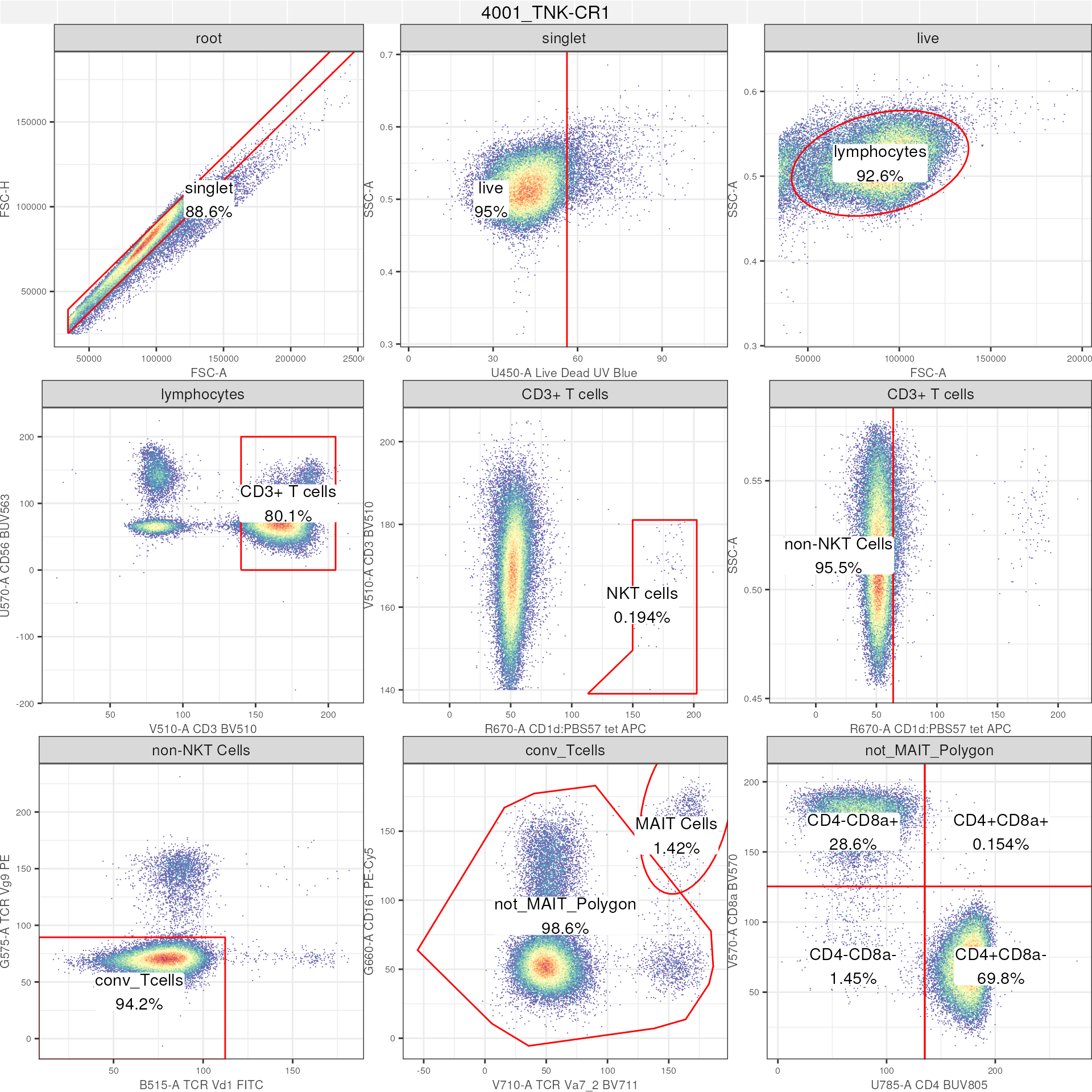
- Specific node within a
GatingSet
# GatingSet: single gate
autoplot(gs,
         gate = "CD3+ T cells", # plot a specific gate for all samples
         bins = 256)+
         ggcyto_par_set(limits = "data")+
         axis_x_inverse_trans()+ # inverse transform the axes
         axis_y_inverse_trans()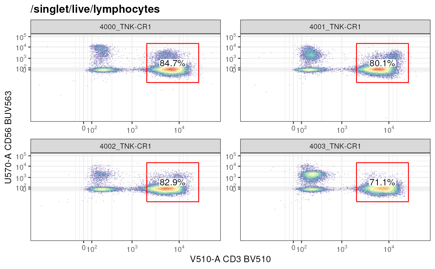
Note: When working with GatingSet or
GatingHierarchy, the autoplot method does not
take x and y parameters. Rather either
a gate can be specified or if left unspecified, the
entire GatingHierachy is plotted.
Granular control using ggcyto
The ggcyto method takes us 1 step deeper into granular
control when visualizing cytometry data. Using this method, users can
now start to make visualizations not afforded by
autoplot.
- Bivariate plot for data within a specific node using markers other than those defined for a node
ggcyto(gs,
       subset = "singlet", # extract data at specific node
       aes(x = "CD8a", y = "CD4"))+ # any marker combination
  geom_hex(bins = 256)+
  facet_wrap(~name)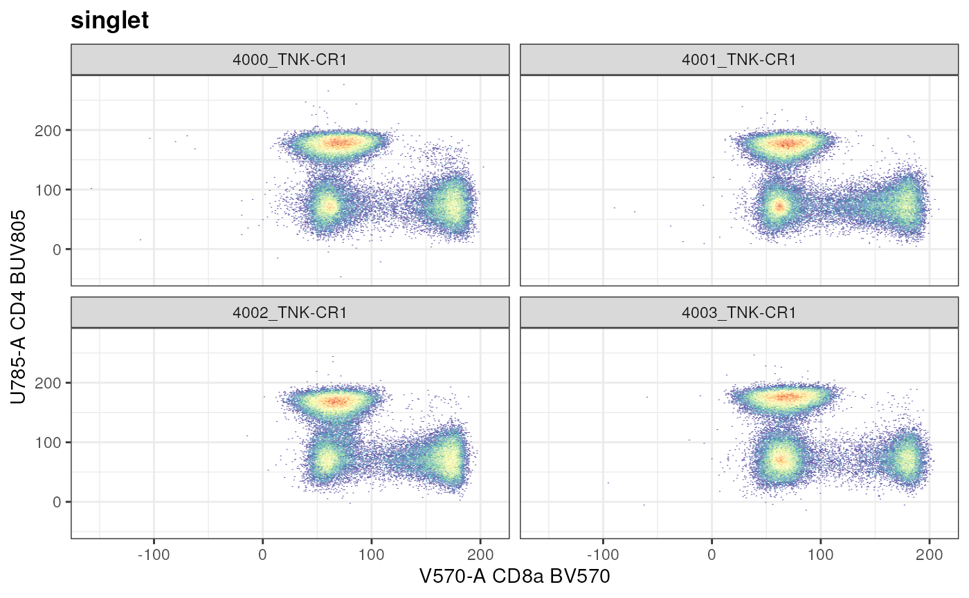
The marker combination “CD8a vs CD4” is used to at the node
/singlet/live/lymphocytes/CD3+ T cells/non-NKT
Cells/conv_Tcells to define CD4+ vs CD8+ T cells. Unlike with
autoplot, ggcyto method allows us to look at
the data from the point of subset. In the above example,
subset = "singlet".
Exercise
- Repeat the previous plot, but
facet_wrapupon another variable.
During reporting, it is possible that users would want to see
# get a gate
cd4_gate <- gs_pop_get_gate(gs,"CD4+CD8a-")

ggcyto(gs,
       subset = "singlet", # extract data at specific node
       aes(x = "CD8a", y = "CD4"))+ # any marker combination
  geom_hex(bins = 256)+
  facet_wrap(~name)+
  geom_gate(cd4_gate)+ # plot gate
  geom_stats(type = "percent")+ # on the fly calculation of the "gate" event
  axis_x_inverse_trans()+
  axis_y_inverse_trans()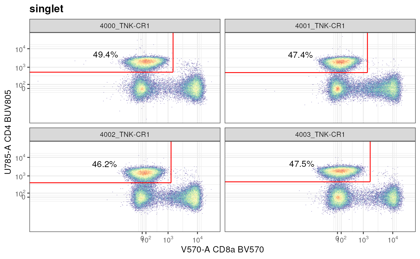
Exercise
-
Repeat the above plot but now set the parent subset to be the
"not_MAIT_polygon". Why does your plot look different than the previous one?Answer: The
singlet/CD4+CD8a-population that in effect we were visualizing, was not defined in theGatingSet; instead the parent node toCD4+CD8a-is non-MAIT conventional T cells (/singlet/live/lymphocytes/CD3+ T cells/non-NKT Cells/conv_Tcells/not_MAIT_Polygon/). This ad hoc visualization tells us that CD4+ cells (not sure at this point if they are CD3+ T cells) are ~47% of totalsingletpopulation that we had defined.
In a similar manner, we can use a newly defined gate to interrogate
the GatingSet.
new_gate <- flowCore::rectangleGate(
  list("V570-A" = c(150,210),
       "V510-A" = c(140,210)),
  filterId = "CD3+CD8a+ Cells"
)
ggcyto(gs,
       subset = "singlet", # extract data at specific node
       aes(x = "CD3", y = "CD8a"))+ # any marker combination
  geom_hex(bins = 256)+
  facet_grid(mock_treatment~name)+ # facet according to treatment
  geom_gate(new_gate)+
  ggcyto_par_set(limits = "data")+
  geom_stats(type = "percent")+
  axis_x_inverse_trans()+
  axis_y_inverse_trans()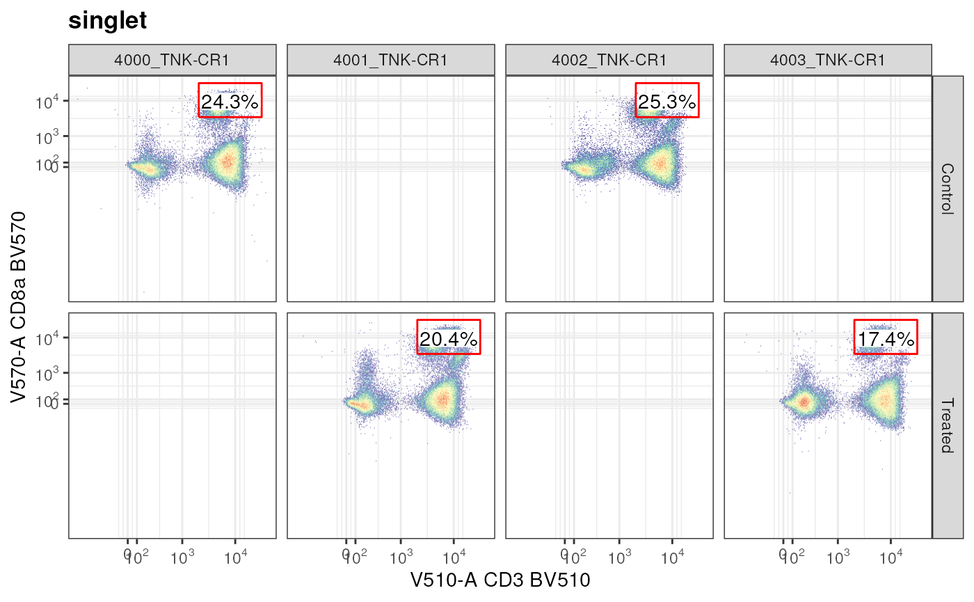
We created a gate, did not apply it to a GatingSet
directly, but rather made an ad hoc plot regarding CD8a+ CD3+ T cells
from the singlet node. This plot also shows how metadata
from pData is available to facet the plot.
Expression using histograms and densities
A common way to report or view specific population data is to ask whether there is a change in expression levels (fluorescence intensity) across samples or groups.
Let’s take a look at PD1 expression in CD8+ T Cells
cd8 <- as.ggplot(ggcyto(gs,
       subset = "CD4-CD8a+",
       aes(x = "PD1"))+
  geom_histogram(bins = 125, fill = "yellow", color = "black")+
  facet_wrap(name~mock_treatment,ncol = 1, scales = "free_y")+
  ggcyto::labs_cyto(labels = "marker")) # labeling only marker
cd8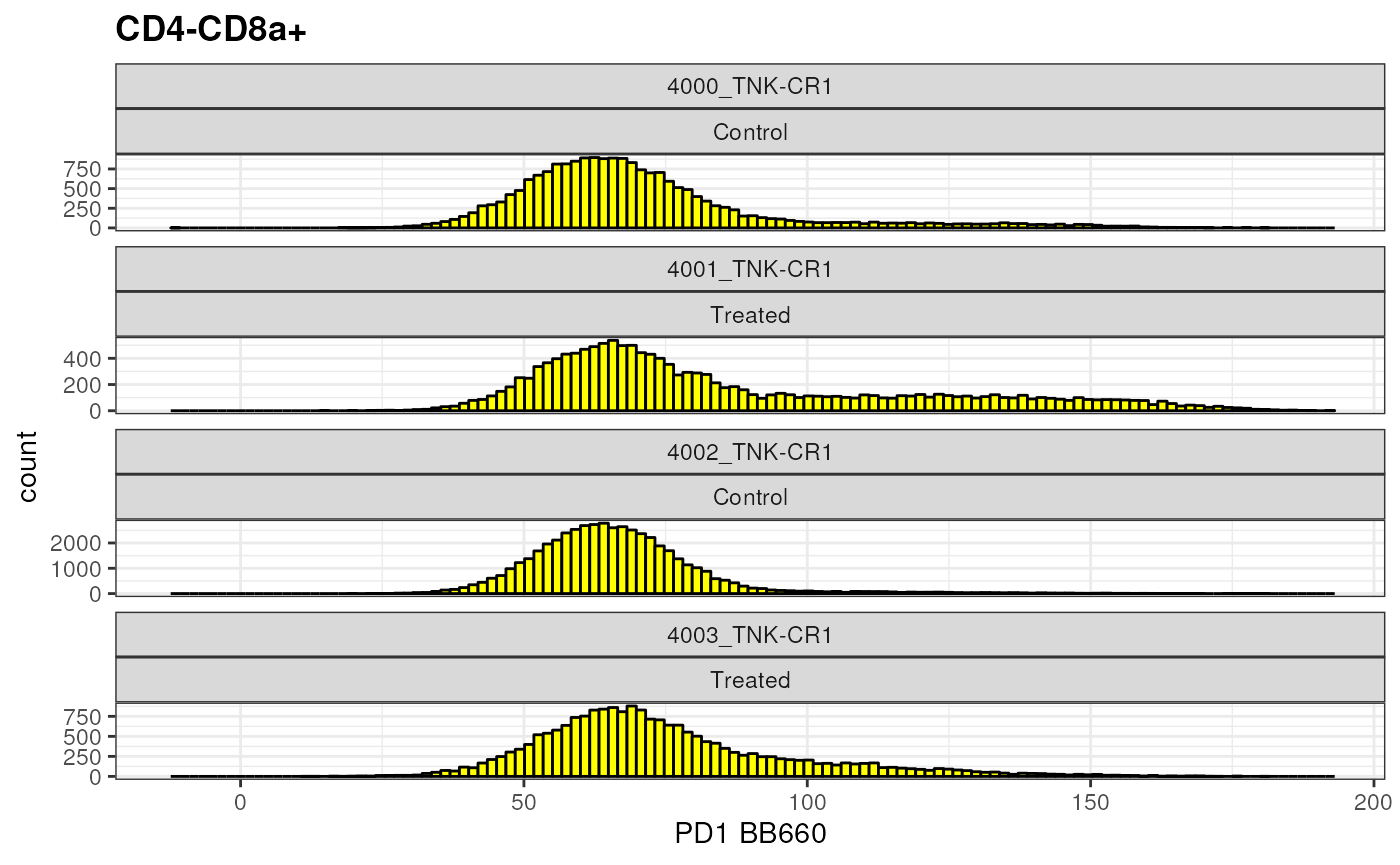
What if you would like to compare 2 different populations side by side?
cd4 <- as.ggplot(ggcyto(gs,
              subset = "CD4+CD8a-",
              aes(x = "PD1"))+
  geom_histogram(bins = 125, fill = "blue", colour = "black")+
  facet_wrap(name~mock_treatment,ncol = 1, scales = "free_y")+
  ggcyto::labs_cyto(labels = "marker")) # labeling only marker

gridExtra::grid.arrange(cd4,cd8, ncol =2 )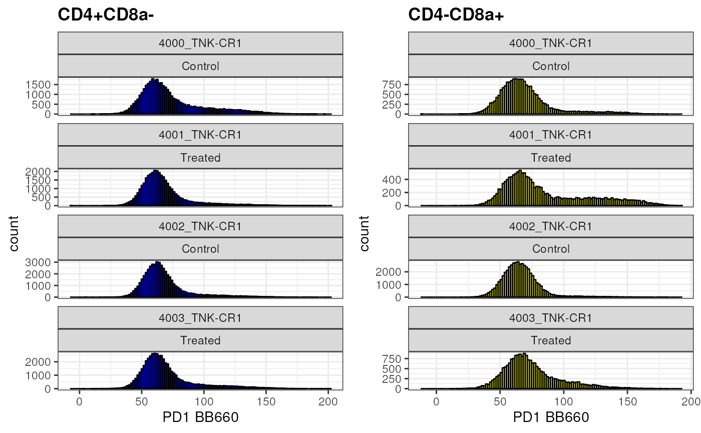
Or, if you would like to compare population on top of each other?
overlay <-ggcyto(gs,
                  subset = "CD4+CD8a-",
                  aes(x = "PD1"))+
  geom_density(fill = "red", alpha = 0.3)+
  geom_overlay(
    data = gs_pop_get_data(gs,"MAIT Cells"), # extracting information regarding a different population
    fill = "black", alpha = 0.5)+
  axis_x_inverse_trans()+
  labs(title = "Comparing expression of PD1 in 2 distinct T cells: CD8a+ (red) and CD161+ Va7_2+ MAIT Cells (black)")+
  facet_wrap(mock_treatment~name, nrow = 1)+
  theme(aspect.ratio = 1)
overlay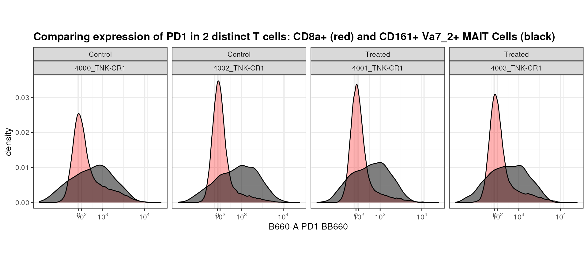
Seems like MAIT Cells tend to have higher PD1 expression than CD8+ T Cells! This may be an interesting observation that is worth following up on.
Backgating and overlays
There are instances when you may want to visualize a gated population
(children/grandchildren/siblings) together with the parent. This is the
idea behind backgating. We have already seen met this approach above
using geom_overlay where density of 1 node was projected on
top of density of a different unrelated node.
Below, we go through another example where we ask the question: what is the general expression level of CD4 and CD8a on MAIT cells compared to all CD3+ T cells?
mait_expression <- ggcyto(gs,
                          subset = "CD3+ T cells",
                          aes(x = "CD4", y = "CD8a"))+
                   geom_hex(bins = 256)+
                   geom_overlay(data =
                                  gs_pop_get_data(gs, "MAIT Cells"),
                                size = 0.5, colour = "red", alpha = 0.5)+
                   axis_x_inverse_trans()+
                   axis_y_inverse_trans()+
                   facet_wrap(~name, nrow = 1)+
  labs(title = "MAIT Cells (red) overlaid on top of all conventional T Cells")+
  theme(aspect.ratio = 1)
mait_expression 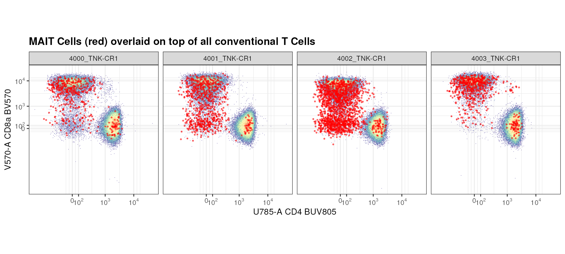
Seems like there are a lot of MAIT Cells that are CD8a+ or negative for both CD8a and CD4 compared to CD4+.
Exercise
- Prepare an overlay as above using the
autoplotmethod.
example <- autoplot(
  # add your code
  axis_inverse_transform = TRUE,
  bins = 256
)+
  geom_overlay(
    gs_pop_get_data(gs, "MAIT Cells"),
    size = 0.5,
    colour = "red"
)- Construct a
rectangleGatefor CD8+ cells and add it to the plot you create. - Why are the scales not inverse transformed?
Conclusion
ggcyto is an extremely flexible and powerful tool to
explore and visualize flow cytometry data. We encourage users to view
additional examples and capabilities of this library here.